During the last couple of weeks I discussed horizontal and vertical alignment, and this week I’m going to discuss cell margins.
I’ve grouped them together like this becaue all three of these things affect the text’s relationship with the borders of the cell. They say how close to the borders it gets, and where the white space is distributed to.
Cell margins specify how much white space should be between the edge of the cell and the text. Some programs will only let you set right & left margins, and some will let you set top and bottom ones as well. It’s like the margins on a sheet of paper — the plain borders where there’s nothing printed. The programs which only let you set right and left margins might refer to it as “indent” instead of “margins.
For example:
| Cell margins/Indentation |
|---|
| Default margin |
| Margin of 0 (zero). |
| Margin of 25 (twenty-five). |
| Margin of 50 (fifty). |
Note: These values (0, 25, 50) are for HTML margins. Every program will calculate differently — yours might go by pixels, or inches, or character widths, or percentages. Most of them give guidelines on what range it wants the values to be in, which will help you get started. It’s also worth noting that while I made all 4 of the margins the same in these cells, you don’t have to. The top, bottom, right and left margins can all be different from each other. Just experiment until you get what you want.
There are really only two things you can do with cell margins: increase white space, and decrease white space. But there’s a lot of different reasons why you might want to do one or the other! Here’s four examples.
Making things fit
Sometimes for my job I need to make lists of people’s names, to be printed in various formats. Some people have short names, and some people have long names, and that’s okay. But some people have names that are just a titch too long. Take, for example, the list of U.S. Presidents. If I use the default margins, it looks like this.

Now, I could have just leave it like that. But it visually disrupts the flow of the table, and adds almost a whole line of unnecessary white space that looks pretty funny in the middle. I could make that column wider, but that wouldn’t match the width of the other columns and could make the table look unbalanced. I could also make all the columns wider so they match, but that could make the table too wide to be printed on a single page.
However, if I change the right and left cell margins from .15″ to .1 it changes to this.

The only thing to really remember about adjusting the cell margins like this is that if you adjust the margin that the cell is aligned to (i.e. the left margin for left-aligned text) then you’ll probably want to do the same for every cell in that column. Otherwise the smooth line of the visual edge will be disrupted.
Indenting sub-items
Remember the financial report I did back in the horizontal alignment section, with all the main headers left aligned, and the sub-items right aligned? That technique is pretty effective for separating the two levels, but you can achieve an equally good effect by leaving the sub-items left aligned and increasing their indent, like so.
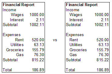
This technique also makes it easier to have multiple sub-layers if, for example, you wanted to break out the groceries by store to see where you spent the most. You could just indent the individual stores twice as much as you indented the “Groceries” header, whereas you couldn’t make the individual stores twice as right-aligned.
Shifting decimal numbers
Sticking with the financial report, suppose it had a column of numbers for each month instead of just one. If you want to have center-aligned headers that’s great, but it can look funny with financial data and other decimal numbers. However, if you indent the numbers from the right margin, as shown below, it usually looks better. (Note: Not all programs can indent from the right margin.)

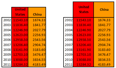
Making stand-out headers
The last example I have for you is using cell margins to make column headers that really pop out. This is most useful when there’s some other formatting tying the column together, and it’s really important to be able to identify the right column quickly. In the example below the only difference between the two tables is the cell margins around the headers in the second table, but I think you’ll agree they make them much easier to read.
It is, of course, possible to achieve exactly the same effect using vertical and horizontal alignment, and manually adjusting the columns to a wide enough width to give you the white space you want. But if you use cell margins it’s easier to fool around and experiment, which you may have to do if your table is too wide (or even too narrow).